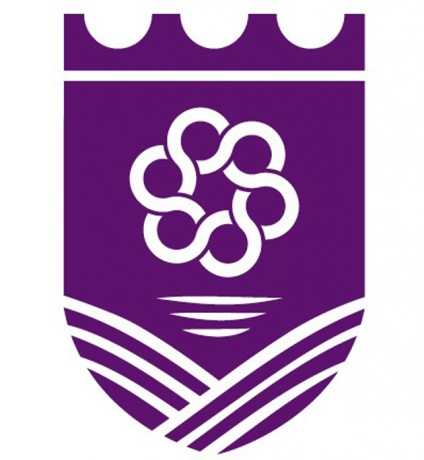
Our new logo
IT IS out with the old and in with the new with the former coat of arms for Fermanagh District Council soon to be consigned to the history books.
So what about our new logo? What does it mean?
Here’s how the designers of the new local explained its meaning.
• The shield shape is used to reflect the old insignia of each of the councils, acknowledging the two districts from which the new council is formed.
• Purple as a colour is one which combines the stability of blue and the energy of red, and symbolises ambition, wisdom, dignity, creativity and independence – perfectly representing the ethos of the new council.
• Our district is a diverse, multi-cultural region. At the heart of the new council identity is the ethos that individuals, communities and businesses work together to prosper. It is for this reason that the symbol for the council is a continuous, infinite woven circle, intertwined to represent individuals working together to create a shared strength and vision.
• The Council wants to encourage individuals and whole communities to grow and deliver opportunities which deliver a better quality of life. This symbol, celtic in it’s styling, is also representative of our people and shared culture.
• When creating the base segment of the logo we took inspiration from our landscape. The Fermanagh and Omagh district is situated in an area of outstanding natural beauty which is a rich tapestry of agriculture, Geo-parks, forests, hills, peatlands and mountains.
• The new logo incorporates water ripples and the agricultural landscape which reflect the breath-taking waterways and green terrain in our district.
• This new brand represents the first step towards that shared future for our council, our district and our people.


